This first sentence was rewritten a thousand times with an unrealistic concept of originality in mind. It failed… it turns out every single word in it has been used before. As natural perfectionists, creatives often fall victim to this unrealistic concept of untapped creativity, and thus the word “trends” becomes a no-no word. What they fail to understand in their silly, idealistic fantasy, is that trends inform originality. So here at Marbury Creative Group, we make it a point to follow the latest trends so that we can utilize them and create our own.
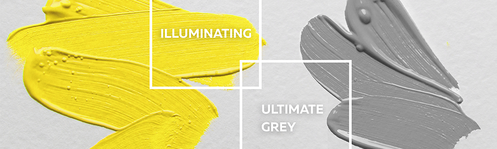
And so we look to creative industry leaders like Pantone, famous for their color-matching system and getting the most hipsters to buy solid-colored squares to use as coasters. Pantone just released their 2021 color of the year: Pantone 17-5104 Ultimate Gray and Pantone 13-0647 Illuminating. Yep, TWO colors were their pick for color of the year, but it’s 2021 and their explanation is valid given the times. Leatrice Eiseman, Executive Director of the Pantone Color Institute explained that the color combination, “expresses a message of positivity supported by fortitude… we need to feel encouraged and uplifted…”, and so with this in mind, we’d like to introduce our new logo:
Looks encouraging and uplifting, right? I guess I’ll have to get our designers to change that back… In reality, the metaphor Eiseman mentioned is what their color of the year is all about. Our logo isn’t going to change, we aren’t going to give our client’s email headers a yellow and gray makeover, but the sentiment of positivity and strength will inform our own creative decisions in the year 2021.
Another zeitgeist tap we look to this time of year is Shutterstock. This stock powerhouse draws upon a well of 200k daily uploads and countless keyword searches to bring us their 2021 creative trends. As the industry standard for all things stock, this annual trend account is what a meteorology report might look like if it reported creative climate. This year they’re forecasting a misfit amalgam of old and new in the design world, an uptick in powerful footage of the natural world, and stringed instruments taking center stage in the musical world. On the horizon for photography is a trend toward gender-ambiguous models and a look further into our inner realities, or as ShuttersTheretock put it, “visual storytelling that examines a wide spectrum of human life.” The latter resonates strongly with us at Marbury Creative Group given our mission to Tell It Better (if necessary, use words). As we look forward toward this photography trends we’re excited to look back and see that we are ahead of the curve with clients like ECOFREAKS and their social media. We’ve integrated this ethos of human experience into their social strategy and ensure that the majority of posts showcase real life situations where consumers would naturally grab their hand sanitizer to remove germs.
Now how to end this… “In conclusion?” Nonono. “So as you see, trends can…”, no, not that either. We need a genuinely original sentence, something that’s never been said before. How about: This is the first of many perspectives by Jordan Marbury, our new Creative Manager.